A little over a week ago I attended Edward Tufte's day-long course on how to visualize information. What follows is a chronological summary of what he presented; the course consists of a series of infographics along with running commentary.
The first infographic was actually an animation: the Music Animation Machine's rendering of Chopin's Berceuse, opus 57 (a lullaby). You can't see that video online, but here's a rendering of Chopin's Etude, opus 10 #7:
There are two powerful elements to these visualizations. The first is that you cannot delete anything from the graphic without removing information. The second is that you can literally choose to hear a note by looking at it.
The next graphic was the following one from Nature (apparently the best source to see people pushing the limits on infographics) showing the epidemiology of SARS:

What makes this graphic so useful is that it includes labels on the linking lines so that it subtly adds additional information. The use of directional arrows also clearly indicates the nature of relationships. It's not perfect though - it could add incident and mortality rates in different countries and not overwhelm the rest of the graphic.
A quick commentary: if you want to create illegible boxes, give them a big, heavy border and use all caps sans serif fonts - that what cigarette companies do on their warnings:

After that we looked at a graphical history of rock & roll:

There's a massive amount of information on this chart - more than any one person can possibly explain. What makes the chart work is that every reader has a chance to look at it and explore it using their own cognitive style. Each user will tease out their own story; if they can't find one then you can tell them one.
Another related point: clutter is not a property of information; it's a property of design. If you've a cluttered diagram you don't understand your information.
The next graphic was a hospital bill overlaid with commentary as to what each element actually meant (alas, no image online). The bill was a two column itemized list; the commentary was provided in boxes next to the components of the list.
Tufte emphasized that the connections between the boxes were via gray - not black lines; this rendered them more visible. The point here was that a grey line was the smallest "visual move" you could make to connect to the graphic and not distract from it.
From there we moved on to a graphic showing cancer survival rates (here's a sample):

Note that the graphic goes from least to most lethal and visually depicts how a person can expect to survive over time. While this may seem trivial, you won't find a chart like this on any major health-related website. And, in fact, Tufte mentioned that he used to show up as the number 3 result in Google queries for "cancer surival rates" - well above any health-related sites.
And here's Tufte's favourite graphic of all time. Charles Minard's description of Napoleon's disastrous advance on Moscow:

What makes this graphic so impressive is that it has six variables on it: location (x&y), time, the size of Napoleon's army, temperature and direction. Without a word, the horror of Napoleon's failed march is immediately obvious. Note that there's no flourish on this map: it's just data.
From there, Tufte lectured on a variety of topics. Here are some random comments:
- We do our best analytical thinking when we are 24-30 inches away from the page. That should help you decide how big a graphic should be
- For serious work, you need data that is adjacent in space (think of a wallchart), not stacked (like a typical Powerpoint presentation)
- Whenever possible, get a 'relevant object' in the room when you're giving a presentation: we are human and love both tactile objects and metaphor
- Sidenotes are "where god wants footnotes"
- When designing a user interface, always focus on what percentage of total screen real estate is data/information (vs. marketing speak)
- Genius of the iPhone is that it reduces the need for stacked paths. Most phones had the same functionality but made it impossibly difficult to get to. One of the reasons why Apple was able to do this is that the screen has 2.5x the resolution of a computer screen (hence the screen is effectively 2.5X larger than a similar-sized phone)
- If possible, don't present rather give people a report ideally containing a "supergraphic" like the Rock & Roll history map. They can read faster than you can speak and will ask questions if they find anything interesting in the supergraphic
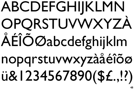
- Gill sans is the greatest typeface ever
- Two tips for presenting:
- See how long you can go in your presentation without saying "I". Will make you appear more informed and professional
- Use the "PGP" rule: say something particular, explain the general principle and then say something particular. This is how teachers educate young kids and it works well
The course also featured a number of great quotes. Here are two:
- John Von Neumann: There's no sense in being precise when you don't even know what you're talking about.
- T.S. Eliot: Talent imitates, genius steals. Apparently Eliot stole this from Oscar Wilde: Good writers borrow. Great writers steal.
And now for some not-so-serious info. Check out this little message that was left in one of my books over lunch:
