I know it's almost impossible to have fun with stats (I've sat through many a boring stats course over the years), but a recent event reminded me of how misleading some statistics and analyses are - most notably anything involving time series and percentages. There's a small library of books on how to lie with statistics, but the recent announcement of the Palm Pre provides a great example.
For background, Palm's a company that was synonymous with mobile computing, until Microsoft got into the game with Windows Mobile and then two companies called RIM (Blackberry) and Apple came along. For the past few years, Palm has drifted and has been consistently losing market share. However, on January they announced the Pre and this propelled their stock price into the stratosphere:
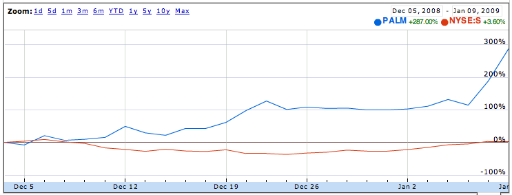
 Note that I've compared them with Sprint (whose share price went up as they're the exclusive carrier for the Pre in the short term) so that you can see the percentage change (all the data comes from Google Finance). This graph is a dataset with a few hundred datapoints and a naive analysis would suggest that Palm was a go-nowhere stock until it announced the Pre.
However, the truth is a little more nuanced than that. In fact, Palm was up over 100% in the first part of December and has been on a tear since January 5:
 As an aside, it's interesting to note the run-up in the stock before December 22nd, when Elevation Partners invested $100M in the company. People who work at public companies go to jail for trading based on this sort of knowledge, yet somehow the market was able to guess that this was going to happen. On Friday the 19th, analysts couldn't figure out why the stock price was going up, and then on Monday the 22nd they got the investment. Hmmm....
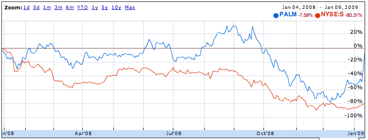
So, now you're thinking, Palm must have been great to their shareholders - I mean, they're up over 200% since early December - that's awesome, right? Except that 2008 was such a bad year for them that they were down almost 80% for the year by the time December started, and now they're almost back to scratch:
 One of my favourite lessons regarding percentages is fully embodied in the graph above: if you're down 80%, that means that you need a 400% increase to get back to where you started. This is one reason why the current financial crisis is going to be really painful for people who bought at the peak. You need a lot of "20% rallies" (about 7) to get you back to where you started if you are down 60-80%.
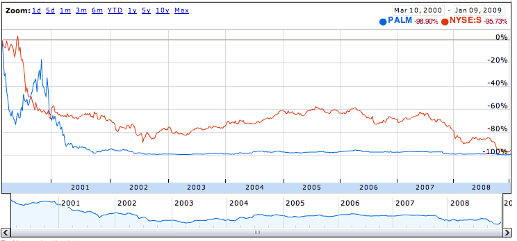
Speaking, of which, let's look at how Palm has done over the years. They IPO'd back on March 2nd, 2000. They pretty much were the peak of the Internet bubble (another aside: through the magic of finance and arbitrage the publicly floated part of Palm was briefly worth more than its entire parent - which still owned 95% of the company):
 They're down a whopping 98.9% since then, so if you bought and held, you're almost certainly never going to get back to where you started (unless they announce a heckuva lot more products like the Pre).
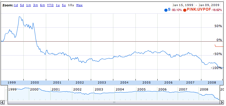
If we go back a little further, we can see one of my favourite facts about percentages in Sprint's share price. For background, Sprint was a darling of the New Economy and gained almost 100% between 1999. It then declined and is down almost 99% over the past 10 years:
 Two things I love here:
- If you're up 100% and then you by twice what you gained (i.e., a $1 stock goes to $2 to $0.01), you're not down, 200%, you're down 99%
- People think there's very little difference between a stock that's down say 99% vs. 99.5%, but in fact the change is massive. The stock has to drop by 50% from when it was already down 99% to get to 99.5%. ($100 -> $1 -> $0.50). This is trivial if you're already down 99%; soul-crushing if you bought in when it was down 99%.
So there you go, some Sunday evening stats. Hopefully it wasn't too painful and maybe even insightful...