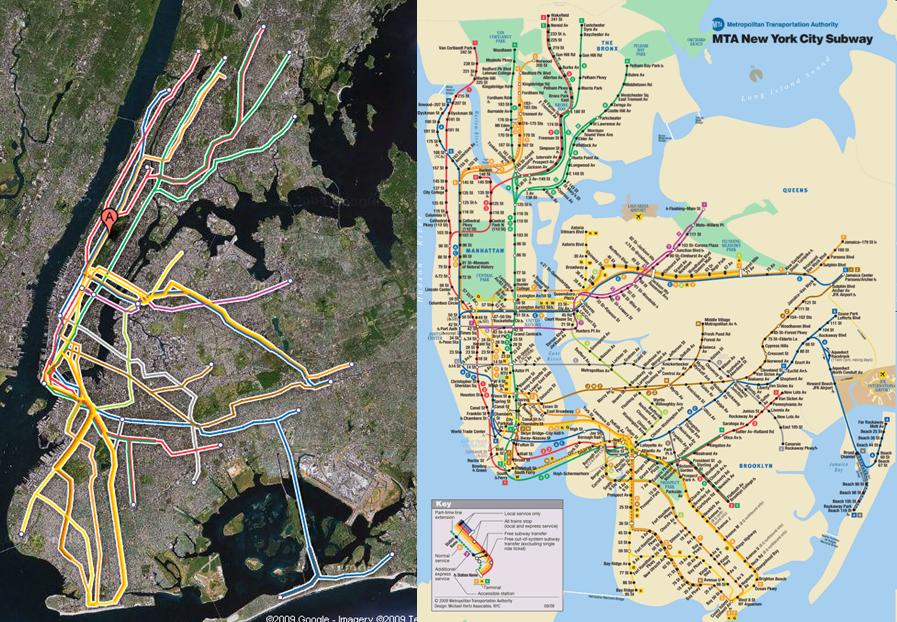
Last week Google added subway lines to the list of items that it shows in Google Maps for NYC. What's neat about this is that we can now plot where the subway lines are in the real world vs. where they appear on the MTA subway map:
A couple of themes emerge:
- Manhattan is ridiculously oversized in the MTA version. Note how much smaller it should be
- If you live in East Brooklyn or the entire borough of Queens you're pretty much out of luck when it comes to subway transport
- It is ridiculous how far the subway lines are from both JFK and LaGuardia
