Last weekend I went over to Emily Carr to check out the graduation exhibit. It's a fount of creativity and fun to explore - the exhibit is grouped by type (e.g., sculpture vs. industrial design vs. art, etc.) so you find yourself using different parts of your brain as you wander the building.
Here are some highlights.
Art
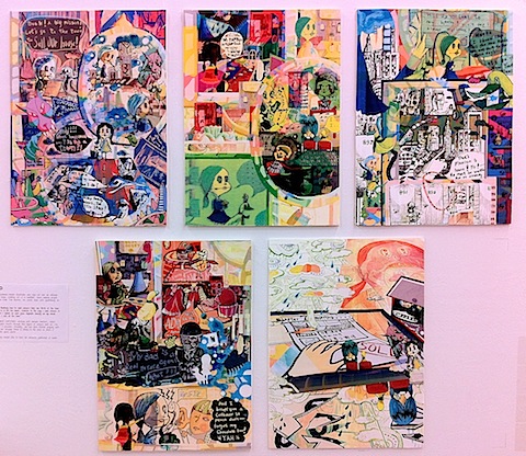
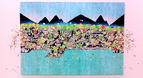
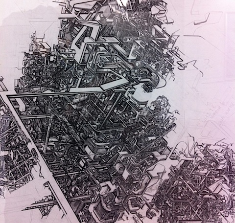
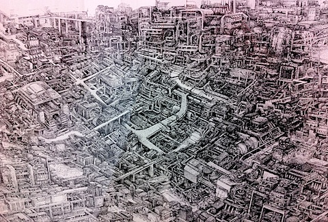
I'm a sucker for line art:
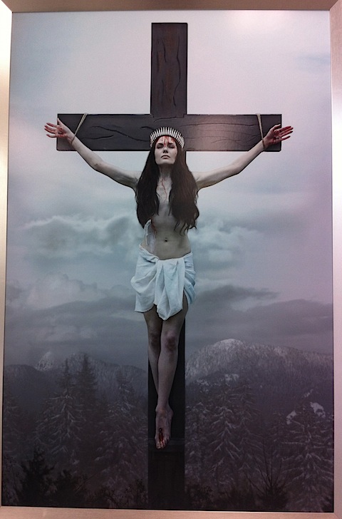
This was just so preposterous that I felt that it needed to be included. Female, West Coast Jesus; hells yeah.
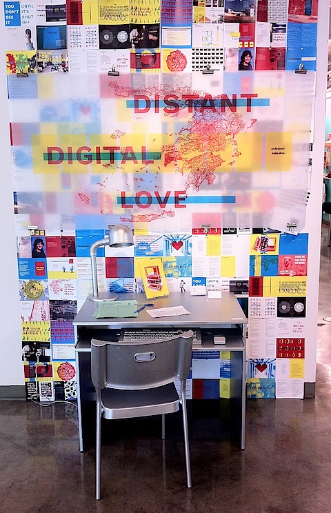
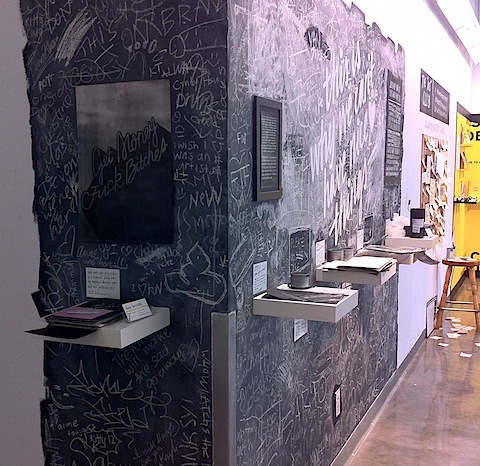
Installations
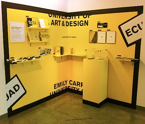
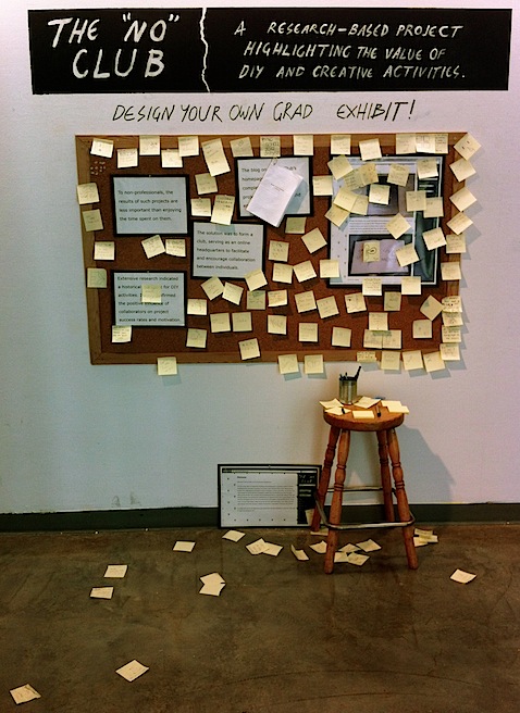
Branding
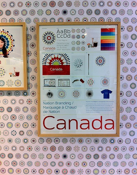
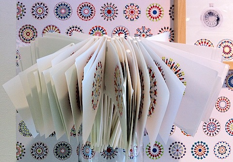
I thought this attempt at rebranding Canada was an ambitious project (plus I'm a sucker for intricately drawn circles - which in this case actually were supposed to convey meaning, not just look pretty):

Industrial Design
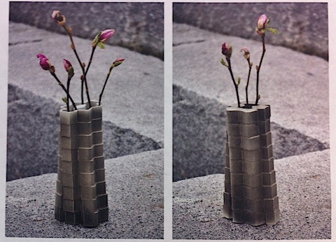
The flip vase can be used in either vertical orientation:
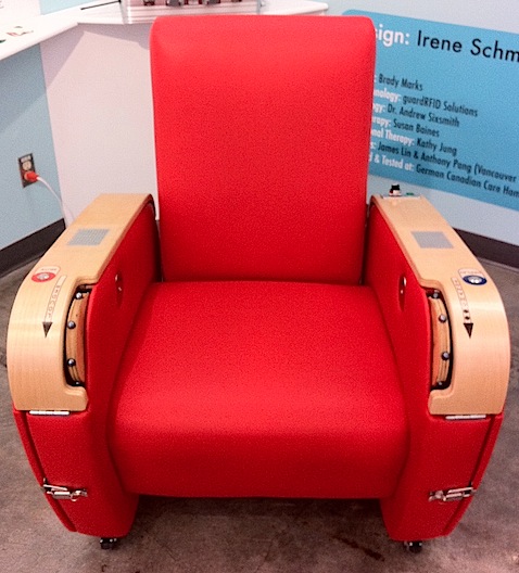
This chair is designed for the elderly; the knobs in each hand rest allow them to easily toggle music on/off and fastforward/rewind.
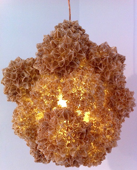
And finally, this beautiful lamp is made out of the byproduct of everyday manufacturing:
