Since I've come back to Canada, I find myself continually (even subconsciously) comparing it with the US. I've noticed that while Canada is roughly 1/10th the size of the States, it feels like it's way less complicated (and sophisticated). This also worries me, as I wonder how we'll continue to compete in a more networked, global, insert your favorite 21st century economy cliche here world.
But I've struggled with how to best articulate this. Whats the language to reflect complexity? How does it affect nations? How can we have a data-driven conversation about this?
After listening to a podcast with Cesar Hidalgo I stumbled onto the Harvard MIT Atlas of Economic Complexity - and I finally think I've the tools to talk about this.
So what is "economic complexity" and why does it matter?
Well, economies produce things. Some of these can be produced by everyone (think dried fish) while some can only be produced by a few (think x-ray machines).
It takes a lot more knowledge to build an x-ray machine than dry a fish. It's more complex (plus a lot of that knowledge is locked in people's heads) ergo fewer countries can do it.
By comparing trade statistics amongst countries you can figure out the relative complexity of all goods produced and traded by all nations.
You can also use these comparisons to map out how products are related. By looking at what countries co-export, you can see the degree to which products are related. This lets us statistically demonstrate concepts that make sense like "countries that export textiles also export finished garments but not airplanes".
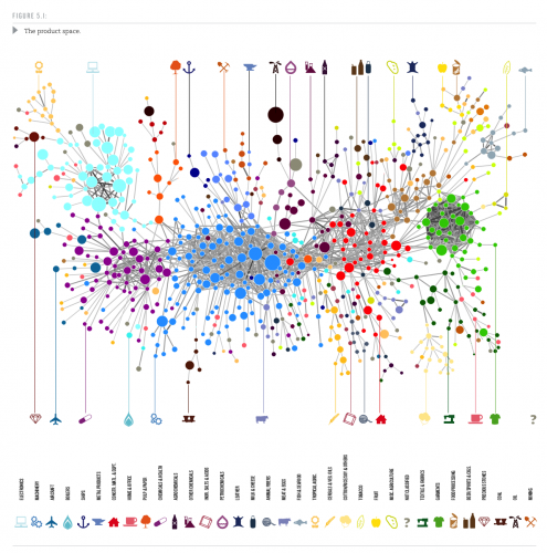
Here's what this map looks like:
In order to understand the rest of this blog post, let's take a walk through it.
Start with the oil well in the upper middle of the map. There's a big brown dot. This shows you that crude oil accounts for a lot of global exports. And it's connected to the teardrop-shape that represents petrochemicals. This means that if you export crude oil it's reasonable for you to move on to refining the oil and exporting it.
Since it's only connected to the teardrop, it means that the only thing you can naturally move into is petrochemical refining (more on this later). If I was to propose that a country's expertise in exporting crude oil should make them succeed at making airplanes, you can now explain why my logic intuitively feels flawed. Airplanes are off to the left of the map, several nodes removed and crude oil is an edge connected only to refining. Success at exporting oil does nothing to directly encourage the ability to build planes.
Conversely, if your country is good at manufacturing, you are thrown into the center of the map and you have more places to go. It wouldn't be surprising to see you get into chemicals or metal products.
It's also important to note that many countries have more than one industry, so Canada for instance exports both crude oil (oil sands) and airplanes (Bombardier). The mapmshowsnthat this is due to historical factors; the two aren't "naturally" related.
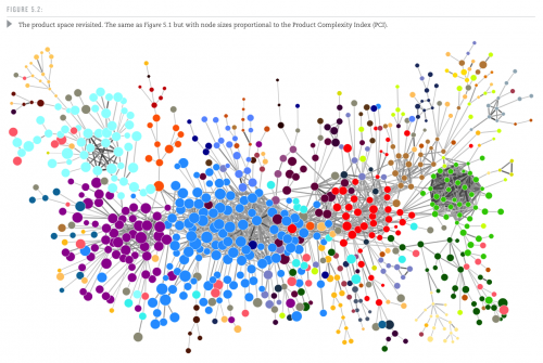
The map above is weighted for global trade. The size of each ball (in jargon: a node) corresponds to that node's share of trade. But what if we looked instead at how complex each product is?
Crude oil is simple stuff; an airplane is complex. If you redo the map based on complexity that crude oil dot is now tiny; the airplane is still big.
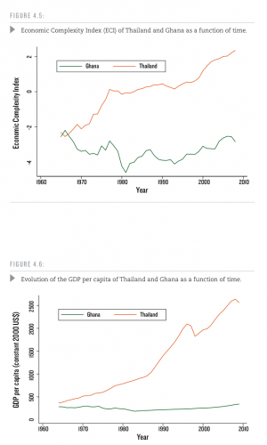
And here's where things get really important. It turns out that if you want to predict how well countries are going to grow, you should look at their ability to export more economically complex products over time.
A great example comes from comparing Thailand with Ghana. In the mid-60s they had similar GDP capita. Adjusting for all other factors (read the paper), you see that the biggest reason Thailand is now wealthy is that they've invested in producing more complex things. This "movement up the value chain" and ability to export it is what has driven their increase in living standards.
So back to Canada and the US. How do we compare and why do I feel uncomfortable?
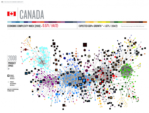
Let's start by looking at the Canadian and US product maps. Here, we take the map from above and put a black box around the nodes on the map that matter to a country. Here's Canada:
Good news: we've a lot of black boxes and several are on big circles. Bad news: these circles tend to be commodities with low complexity and off on the edge of the map.
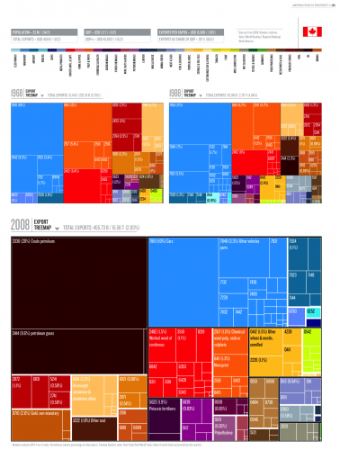
Let's look at how this is changing. Here's how our exports break down over time:
We can see that oil and other commodities increasingly define our exports.
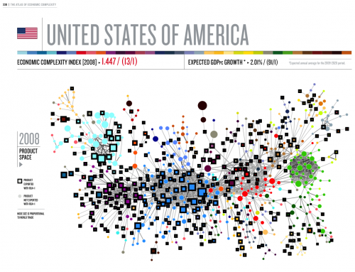
Now let's look at America:
Dots everywhere; you're looking at a complex, diverse economy that makes just about everything except clothing and electronics. And has no oil to export.
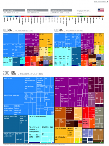
This shows up in the export statistics. Look at all that machinery, chemicals, aircraft and (relatively declining as a share) electronics. Clothing is nonexistent.
And this disparity is why I worry about Canada.
Living in Canada you constantly hear about two things:
1) Housing
2) The Oil Sands and other commodities
The Oil Sands and commodities live on the edge of the maps above and have low economic complexity. This means that they don't do a lot to stimulate other industries and build a robust, diverse economy.
We're building a less sophisticated, less dynamic economy that's dependent on one thing we don't control: commodity prices.
A commodity price collapse will be death to Canada; the map shows us that a lot of our major industries will literally have nowhere to go. In contrast, America's have a lot of leeway. You can retool your factory to do something else; oil rigs only drill oil.
And what about housing? Well, I now have a sense of why so many Canadians "invest" I'm real estate. The map suggests how industries evolve and therefore where your expertise would be most likely to succeed.
If you're an oil exec, you could invest in a refinery and legitimately contribute knowledge (and therefore reduce risk/make the venture more successful). You are "dumb money" if you invest in a tech startup or an airplane manufacturer.
But good luck opening up a new oil refinery. It's way too capital intensive for any individual investor. Instead, you go buy another house or financial assets like stocks. And that's probably part of the reason why every Canadian newspaper has large sections on commodities, housing and stocks.
The other scary thing here is that it explains why Canada is so crappy at producing globally competitive companies outside the commodity space. When you're at the edge of the network, there's just not as many places to go. We don't have the expertise at the center of the network necessary to create those companies in meaningfully large sectors like electronics, chemicals or vast swathes of manufacturing.
So, what can we do? Well, the map isn't destiny; you can go anywhere on it, it just might be really hard to get there.
The first thing we should do is decide where we want to play on the map (hint: in the middle in heavily connected nodes like high end machinery, chemicals, electronics and construction equipment).
Then, we'd do all we could to encourage it. Kill any subsidy to other industries (why do we subsidize aircraft if they're at the edge?), do everything reasonable to reduce red tape or obstacles for companies in the middle of nodes, better training for those folks (let the oil patch pay more if they need more workers in Fort Mac), etc.
It remains to be seen what will happen to the Canadian economy, but I'm betting on a very hard landing over the next five years. The map gives us one more tool to explain why - and shows just how different Canada is from America.
