It was a loud bang. I totally missed that pothole. I knew the road was bad here – they’re rebuilding the convention center and there’s been some subduction – but how did I miss something that big? And then they car started shouting at me. I had 13 PSI in my tire and had to… Continue reading The Moment of Truth
The Great South Seattle Conflagration
During the October 12, 1977 World Series game in New York Howard Cosell famously said “ladies & gentlemen the Bronx is burning” as he watched a fire erupt nearby: Except if you watched that video you’ll notice that he never actually said his immortal phrase. Seems like an urban legend. But what’s not an urban… Continue reading The Great South Seattle Conflagration
What’s Your Favorite AI?
It sounds like a silly question: “do you have a favorite AI?” After all, they’re not like socks or a book. How do you even know when you’re dealing with one? I know what a sock looks like so I definitely know when I see one. In pairs. Hiding behind my dirty clothes. Maybe exposed… Continue reading What’s Your Favorite AI?
Geometric Growth & the City
I’m convinced that humans aren’t wired to understand geometric growth. Linear growth – the notion that you get x more of something each time period – makes total sense to us as the math is easy to do in your head. But geometric growth – you get x percent more of something each time period… Continue reading Geometric Growth & the City
The Manhattan Project
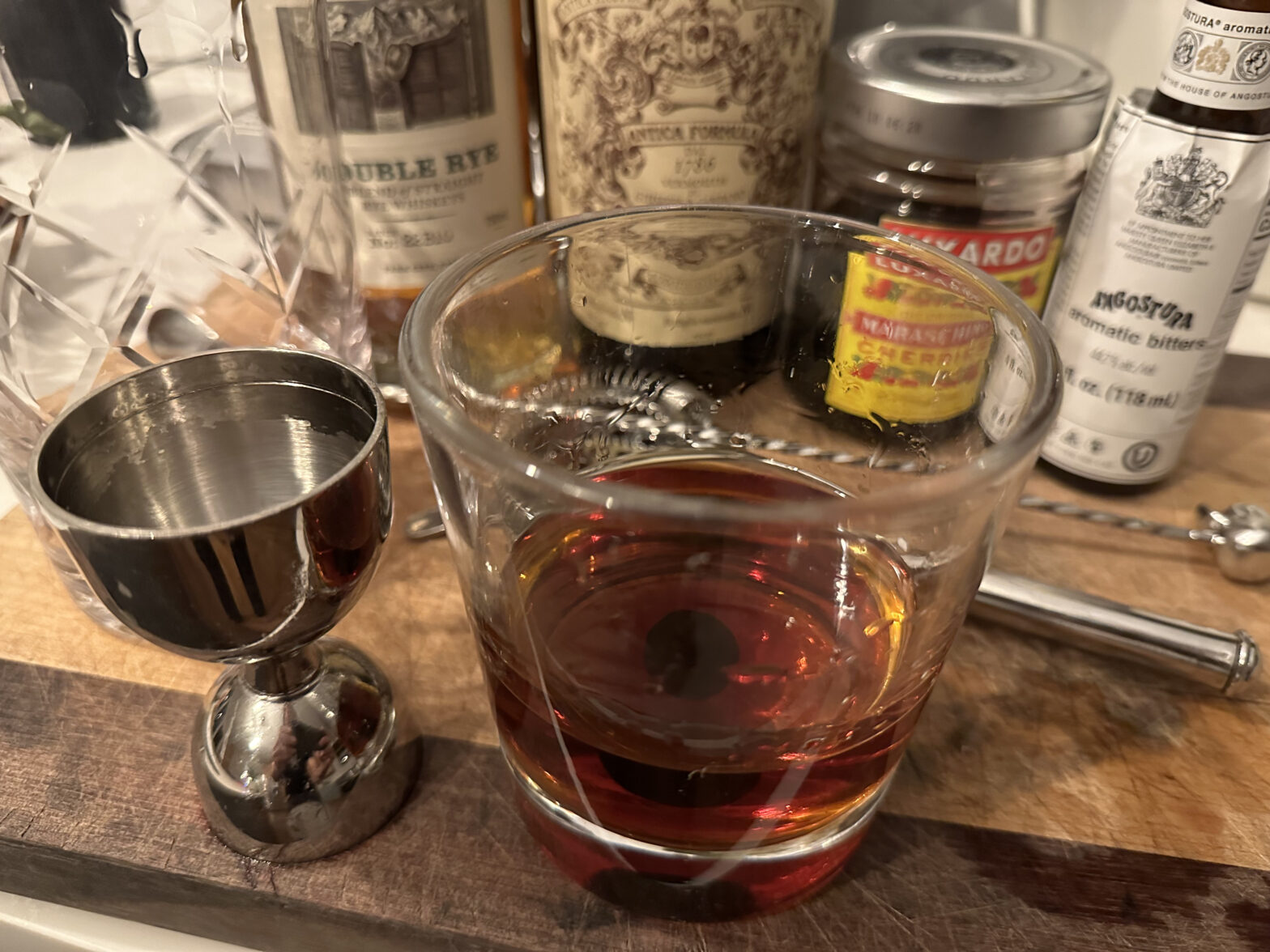
A friend of mine recently sent me a link to a set of vintage cocktail books. I wanted to trace the history of the Manhattan because it is easily my favorite drink. Wikipedia suggests the drink may have been invented as early as 1860. However, there’s no mention of the Manhattan in early cocktail manuals… Continue reading The Manhattan Project